Sealights

Product Design
Project Overview
I’ve joined the team at Sealights in order to establish a proper design process that resulted in a scalable, user-oriented UX solution for a complex system, with the aspiration of creating a holistic, streamlined design of all 3 main features (areas) of the product's web app.
My Contributions
As a lead product designer, I joined the R&D team and worked closely with the backend, frontend, and customer success teams in an effort to fully understand the backend technology, be an integral part of the frontend implementation and be aware of the users’ needs and challenges.
About Sealights
A Startup based in Israel
30 - 40 People
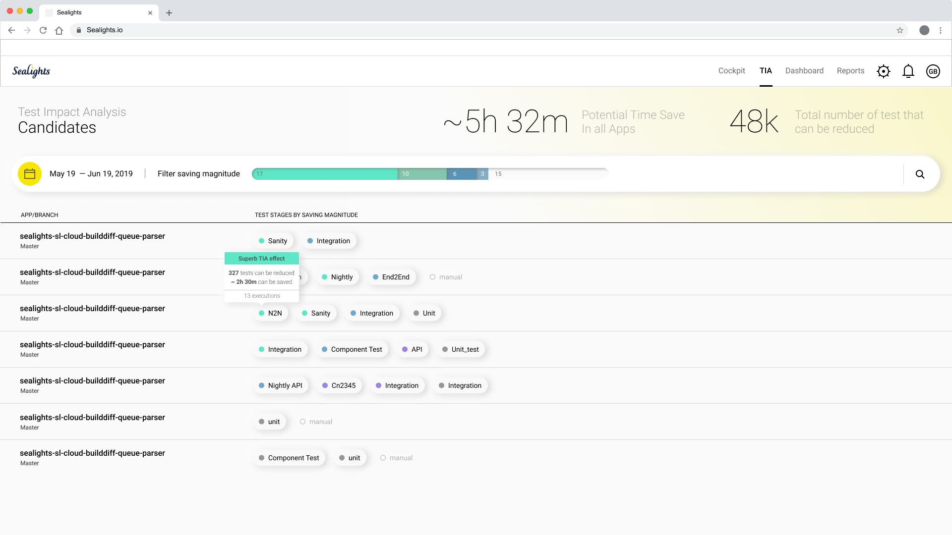
Sealights is a fast-growing startup developing a b2b software aiming to intelligently increase code quality and development velocity by mapping unnecessary tests on one hand and pointing out test gaps and quality risks (test gaps already in production) on the other. The technology provides analytics on top of the code coverage, helping teams to set a quality bar, prioritize risks and avoid long debugging processes.

Sealignts as a product has a huge challenge, they have the ability to speed up the development process but in order to get all the value the technology can offer, the customer has to go throw a process where we point out all the gaps and holes, and how things can be better - this means they sometimes have to work a bit harder in the beginning and let's face it no one really wants to head the truth. So the product had to become much less overwhelming, much clearer and focused, and the main actions should pop out so the user would instantly (well, faster...) know where to go and what to do next. 
The Old System
Quick Overview I promise
By the time I got to Sealights, the product was already designed by 2-3 designers, Over 3 years. The backend technology during that time was immensely evolving at a fast pace and the changes in the "designing hand" resulted in an unclear, unfocused, overwhelming interface. Color coding was unclear and inconsistent, the amount of data and metrics was too much even for a power user.
Colors & Typography
The leading colors turned to white and yellow, with a bit of dark blue (brand colors).
Status colors got some fine-tuning, and most of the black gave way to two supporting grays in different opacity levels. 

Regarding the typography, we switched the typeface from Nunito (which is a good font family) to Roboto. We needed something a bit more neutral, narrower, and not as roundish. Looking forward - Roboto had also monospace, Condensed, and slab variations that would possibly come in handy as the product grows.
New System Design
In less then a nutshell
Dealing with a complex system like Sealight can sometimes be frustrating.
As a product designer, I have this (sometimes unrealistic) aspiration that every user will instantly understand everything and will automatically know what to do and what is expected of him. But sometimes the meal is just too big and the only way is to break it into digestible courses. Not to lose the context and keep the navigation and the goal clear.
Drilling Down
Trying to keep the user in context, not take him out to another screen when not necessary. And when we do, keep the navigation clear so he'll know where he is and how to get back.
The Coverage Report Story
This section of the product was something I insisted on eliminating (in its old version, each level of the hierarchy opened a new page and the drill-down was exhausting. So, in a brave move (kudus to the VP R&D) we dropped it. And no one missed it really - except one customer. A big one, a loyal one. That demanded the feature back and gave us an ultimatum. We decided to completely redesign it and to bring back only the bare minimum. Surprisingly we came up with a great feature that (unexpectedly) gave a whole new perspective for many of the customers. As you'll see in the second screenshot - once the user moves to the "Modified" (...code coverage) tab, he sees all the folders/ files/ methods that were/ wasn't modified. Upon filtering the unmodified out - he's left with exactly what he needs to focus on, there's a very very good chance he'll find exactly what he needs and looking for.
TIA in short
Test impact analytics / analysis. Is a ״cost-effective״ method of test running. It constantly scans and learns all the tests running on the codebase and automatically creates a much smaller sub-set of test the actually needs to be run instead of running them all each time. This way saves time, cpu, virtual machines and so on.

You can only imagine - it is way more complicated than that.
with data driven tests, renamed tests, skipped test and more.
But that's the concept :)

I'm running quickly throgh the main stages we had in the process.
final designs follow.
Test Gaps Analysis
AKA TGA. This is probably the future of the whole system IMO.
It gives all the information about uncovered new/ modified code across a time period. Therefor gives a more realistic and practical perspective. Not examining a single build but a wider development process. Tests are not always written instantaneously. It might take a day or two, some might even write code for most of the sprint and then dedicate a few days for writing all those tests (no judging there...)
Quality Trend Report
As the company is continuing to grow and understand better how's using each part of the product, sales and customer success personal raised the demand for a hight level executive summed up report that gives a different perspective of all the data we gather.
Well, There's more (SCM integrations, chrome extension, the cockpit...)
But i'll wrap it up for now